What is a color system?
A color system is a structured approach to using color within a design project. It goes beyond just providing a collection of colors and instead defines how those colors work together to create a cohesive and purposeful visual identity.
Base color token – Fundamental color building blocks used to construct the entire color palette. Atmosphere has created a base token library in order to help the design system grow as new use cases for color are needed.
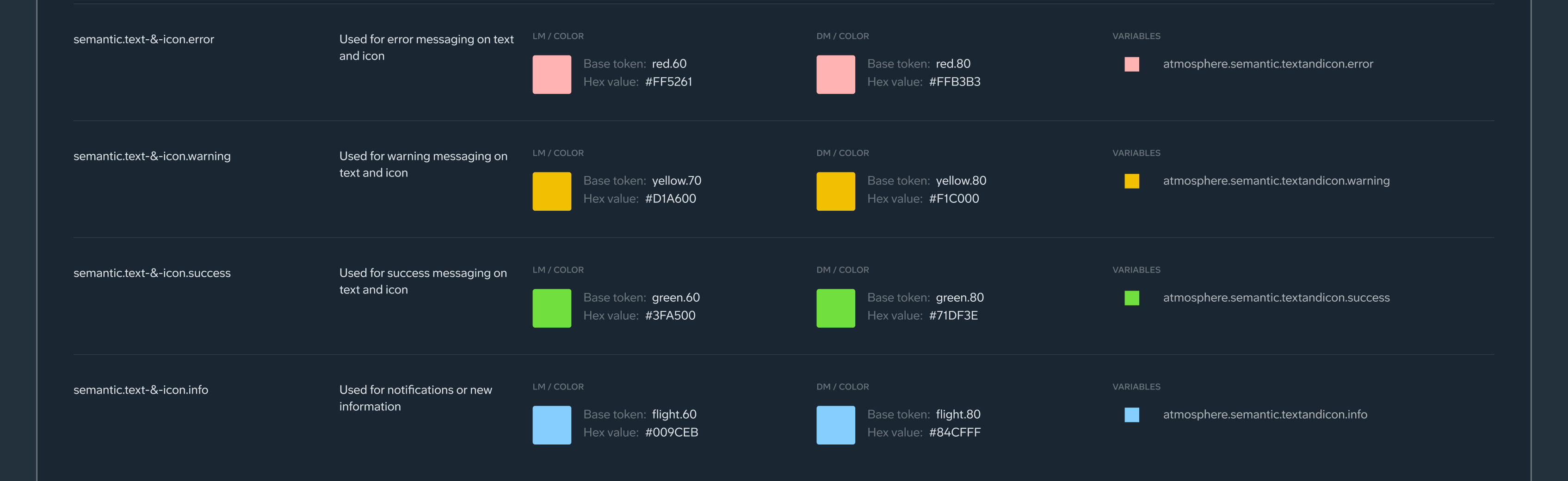
Alias color token – A descriptive label across design and code that reflects a color’s purpose. For example, the alias token is "atmopshere.semantic.border.error" instead of "#FF5261".
General concepts
Alias token names may include words that refer to different roles and behaviors. Here are a few words you may come across:
Interactive – Encourages action within an element or component.
Accent – Enforces distinguished moments for branding and emphasis.
Primary, Secondary – Used to emphasize or de-emphasize foreground elements.
High, Medium, Low – Different emphasis related to color.
Surface – A role used for backgrounds and large, low-emphasis areas of the screen.
Glass (Thick, Regular, Thin, Thinnest) – Visual design detail that mimics the depth of translucent material
Enabled, hovered, selected – Interactive states used in elements and components
Filled, Tonal – Backgrounds for interactive components that either increase or decrease the contrast behind an element.
Inverse – Intended to be the reverse of the light/dark mode of the design or product
Static – Intended to remain the same regardless of light/dark mode
Pair and layer color roles as intended to ensure expected visual results and accessibility.
Improper color mappings can produce unintended visual results.
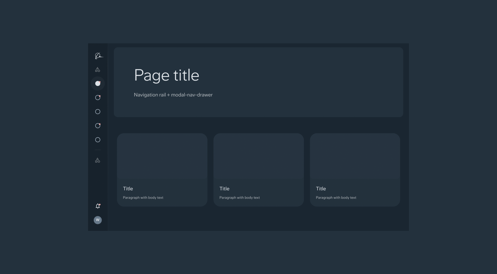
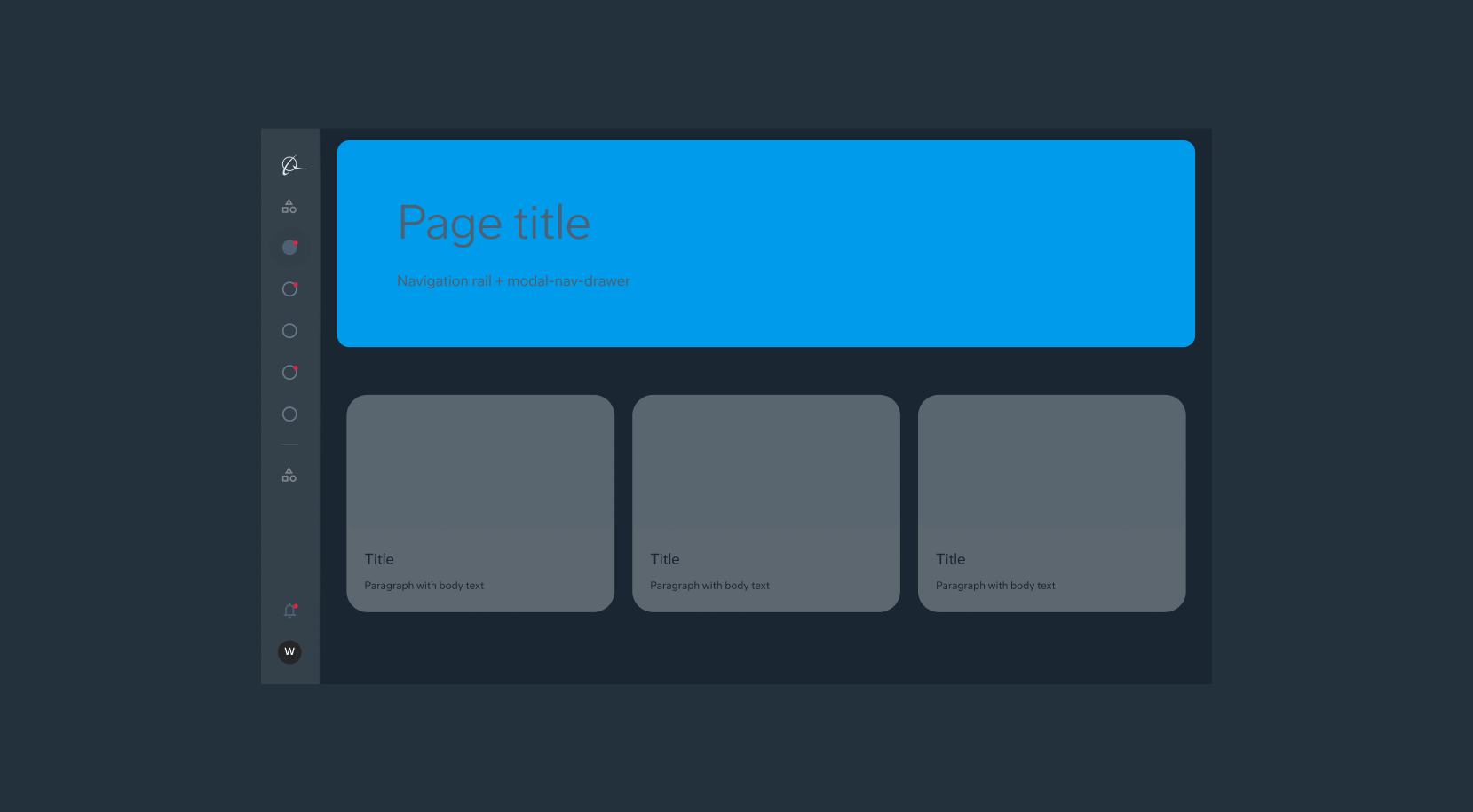
Dark and light mode
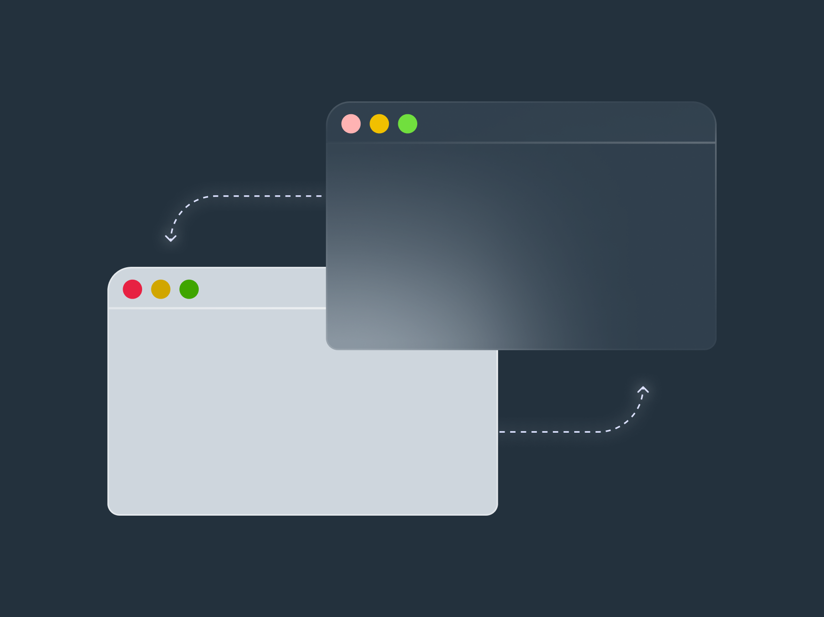
DLS is set up to easily swap
The color palette has been set up to easily swap between light and dark mode. Use Figma variable modes to swap between the two. Due to some figma limitations, there are some slight differences between light and dark mode.
Consider user comfort and readability
Light Mode: Prioritize high contrast between text and background for clear reading, especially in well-lit environments. Bright whites and blacks are common choices, but ensure sufficient contrast for accessibility (WCAG guidelines).
Dark Mode: Aim for comfortable viewing in low-light conditions. Use a dark background with lighter text colors that maintain good contrast.