Boeing’s icon library offers a collection of ready-made icons, saving designers time and ensuring visual consistency across products. The library uses Material Symbols Sharp icons as it’s main base and reference. These guidelines will help you understand when and how to use the icon library.
Reach out to the design system team if you are interested in designing a unique icon not included in this library.
Material symbols
The Atmosphere icons library uses Material Symbols in the Sharp Style in the following combination:
Weight: 400
Filled: Off and On
Optical Size: 24
Sharp symbols display corners with straight edges, for a crisp style that remains legible even at smaller scales.
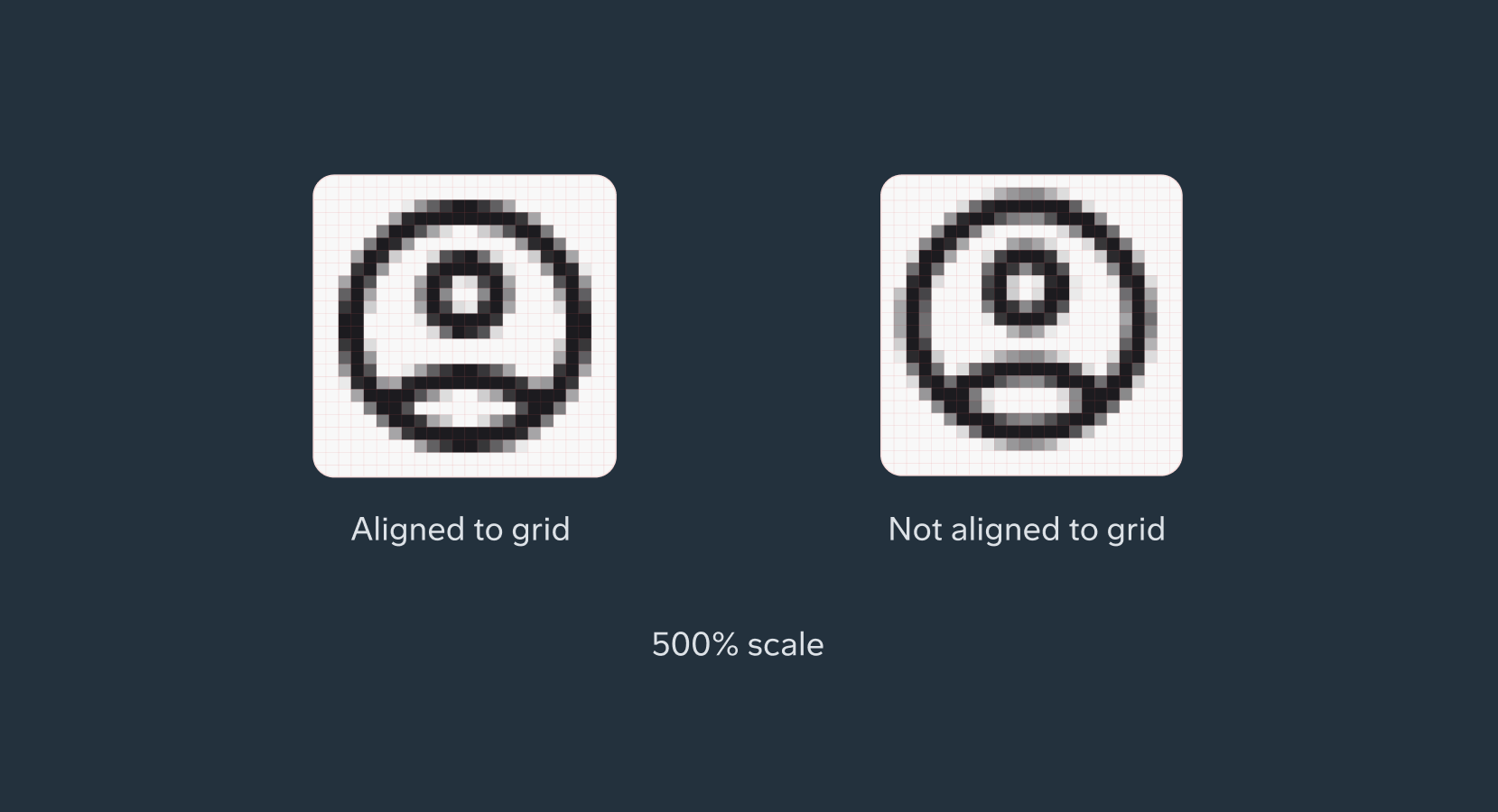
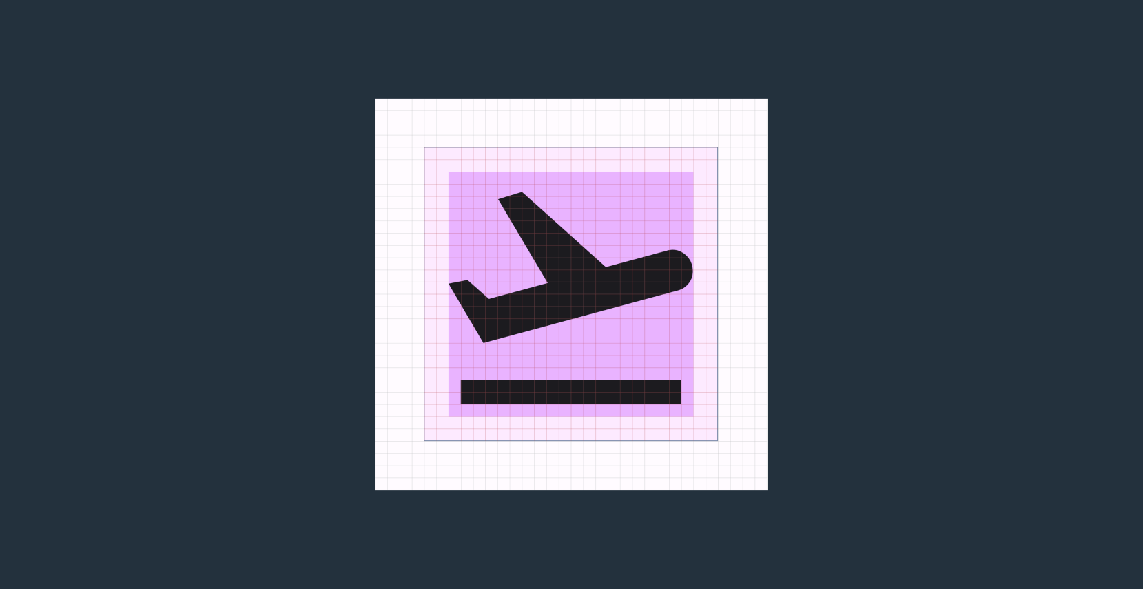
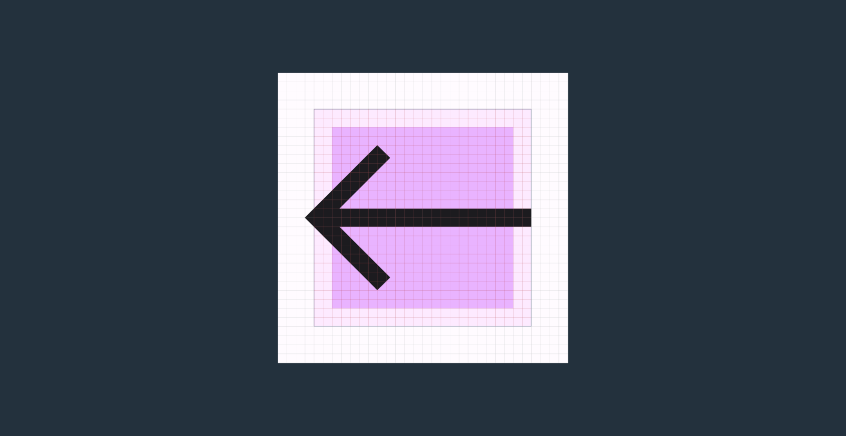
Pixel grid
Icons are aligned to the pixel grid to avoid and maintain sharpness across screen sizes and densities.
Lines that are not snapped to the pixel grid will be too anti-aliased, or grayed. A line that slightly enters a pixel will cause it to gray slightly, creating a “fuzzy” appearance. This is especially noticeable on devices with lower pixel densities. When designing with icons, always check the grid and conduct a pixel preview.
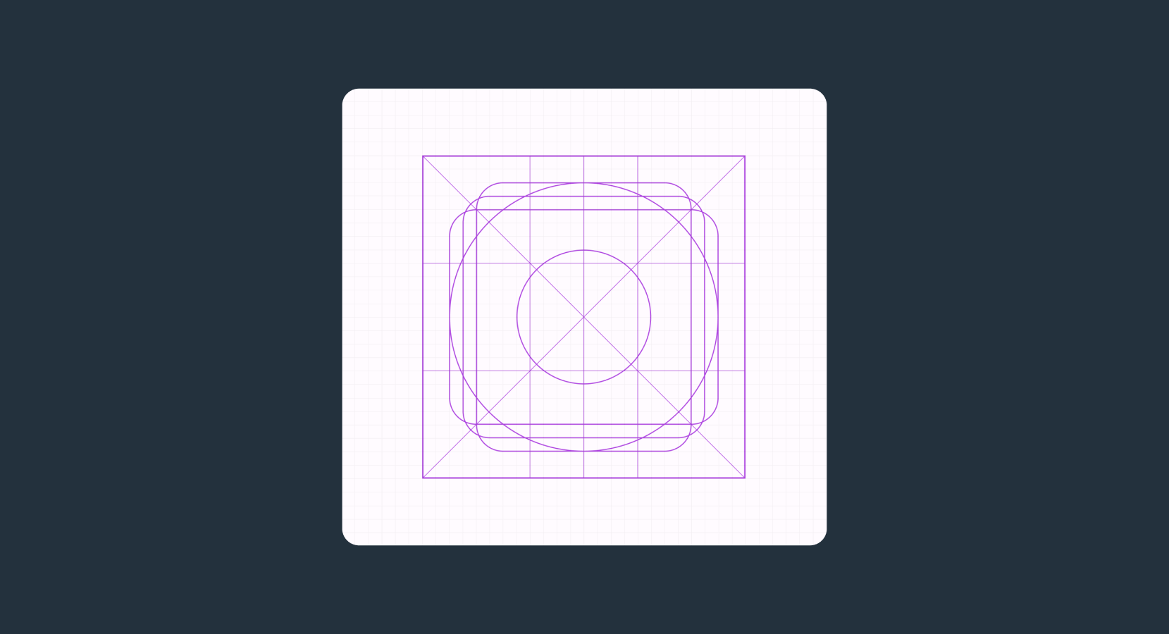
Keylines
Keylines are the grid and structure behind an iconography system. They help maintain consistency and guide the placement of common shapes as the icon library grows.
The diagram on the right shows the underlying keylines for a 24dp icon from Material 3’s library.
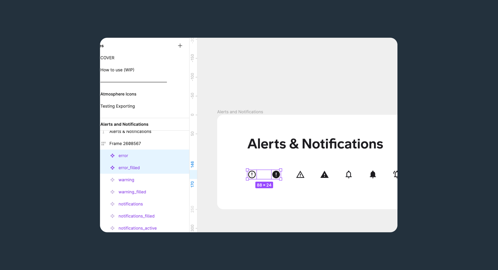
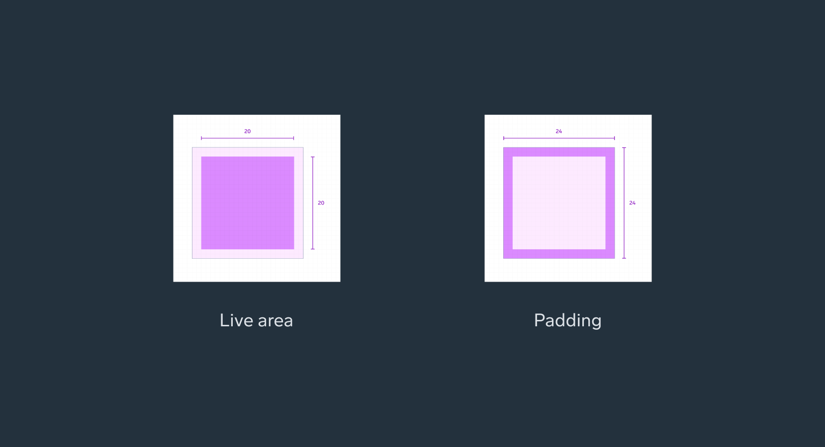
Standard icon layout
Icon content should remain inside of the live area, which is the region of an image that is unlikely to be hidden from view (such as an area where sidebars appear upon scrolling).
If additional visual weight is needed, content may extend into the padding between the live area and the trim area (the complete size of a graphic). No parts of the icon should extend outside of the trim area.
For a 24dp icon, content should aim to stay within the live area (20dp x 20dp) with 2dp of padding.
No parts of the icon should extend outside of the trim area, the content may get cut off beyond the frame and create formatting inconsistency.