- Use layout to direct attention to the action users want to take
- Adapt layouts to Atmosphere default screen sizes & devices
- Use Atmosphere grids as helpers
- Consider how spacing and the parts of the layout work together

- Column: One or more vertical blocks of content within a pane
- Gutter: The space between columns
- Margin: The space between the edge of the screen and any elements inside of it
- Pane: A layout container that houses other components and elements within a single app. A pane can be: fixed, flexible, floating, or semi-permanent
- Spacer: the space between two panes
- Screen size: Inside a breakpoint, the screen size at which a layout needs to change to match available space, device conventions, and ergonomics
Screen sizes & breakpoints
Devices of different sizes and orientations need different layouts. This change in layout takes advantage of device capabilities and user expectations.
A breakpoint marks the change on the screen size at which a layout needs to change to match available space, device conventions, and ergonomics.
All devices fall into one of five Atmosphere default screen sizes classes: extra-small, small, medium, large, or extra-large and components will be optimized to fit these sizes.
Use this set of standard breakpoints to maintain layout integrity across screen sizes. For best results, test designs and code at each of these standard breakpoints.
| Type | Frame | Breakpoint | Devices |
|---|---|---|---|
| Extra Small* (deprioritized) | 360 x 640 | Width = 360 - 599 | Phone in portrait |
| Small* (deprioritized) | 600 x 800 | Width = 360 - 839 | Tablet in portrait |
| Medium | 1024 x 768 | Width = 840 - 1199 | Phone/tablet in landscape |
| Large | 1280 x 720 | Width = 1200 - 1599 | Desktop |
| Extra Large | 2560 x 1440 | Width = 1600 - 2560 | Desktop ultra wide |
*Notice that Atmosphere is not optimized for Extra Small and Small screen sizes, as it is a desktop-oriented Design System. These sizes are depicted only to show the responsiveness of a design, and designers should consider that the Navigation won’t follow the mobile default.
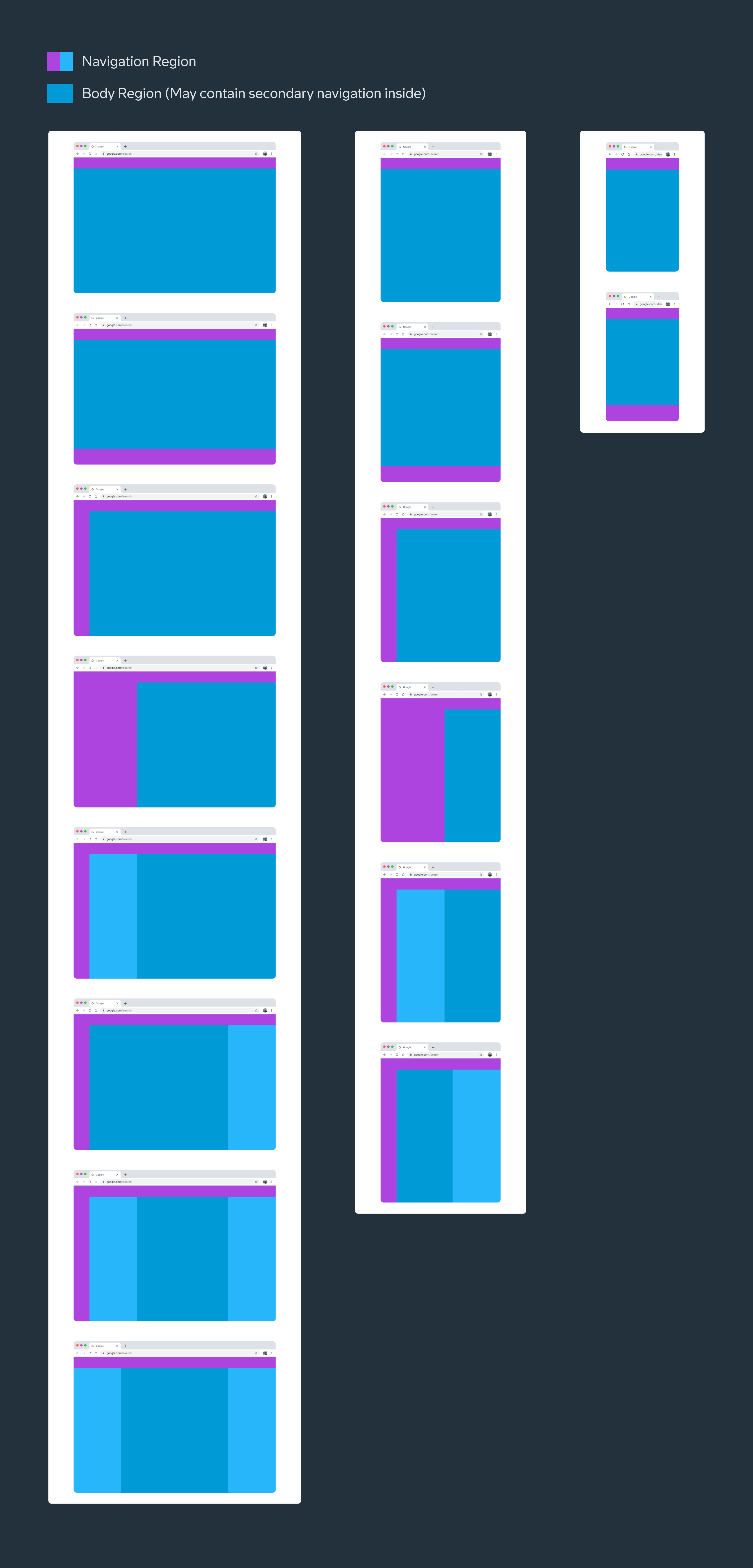
Layout parts
Most Layouts have two regions: Navigation and Body. The navigation region can be placed in different parts of the screen depending on screen size and device.

- Navigation region
- Body region
Navigation region
The navigation region holds primary navigation components and elements such as navigation drawers, navigation rails, navigation bars, tabs, etc.
Elements in this section help people navigate between destinations in an app or to access important actions, and the components used for that may vary in different device sizes and environments.
Body region
The body region contains most of the content in an app, including: Images, text, lists, cards, buttons, app bar, search bar, etc.
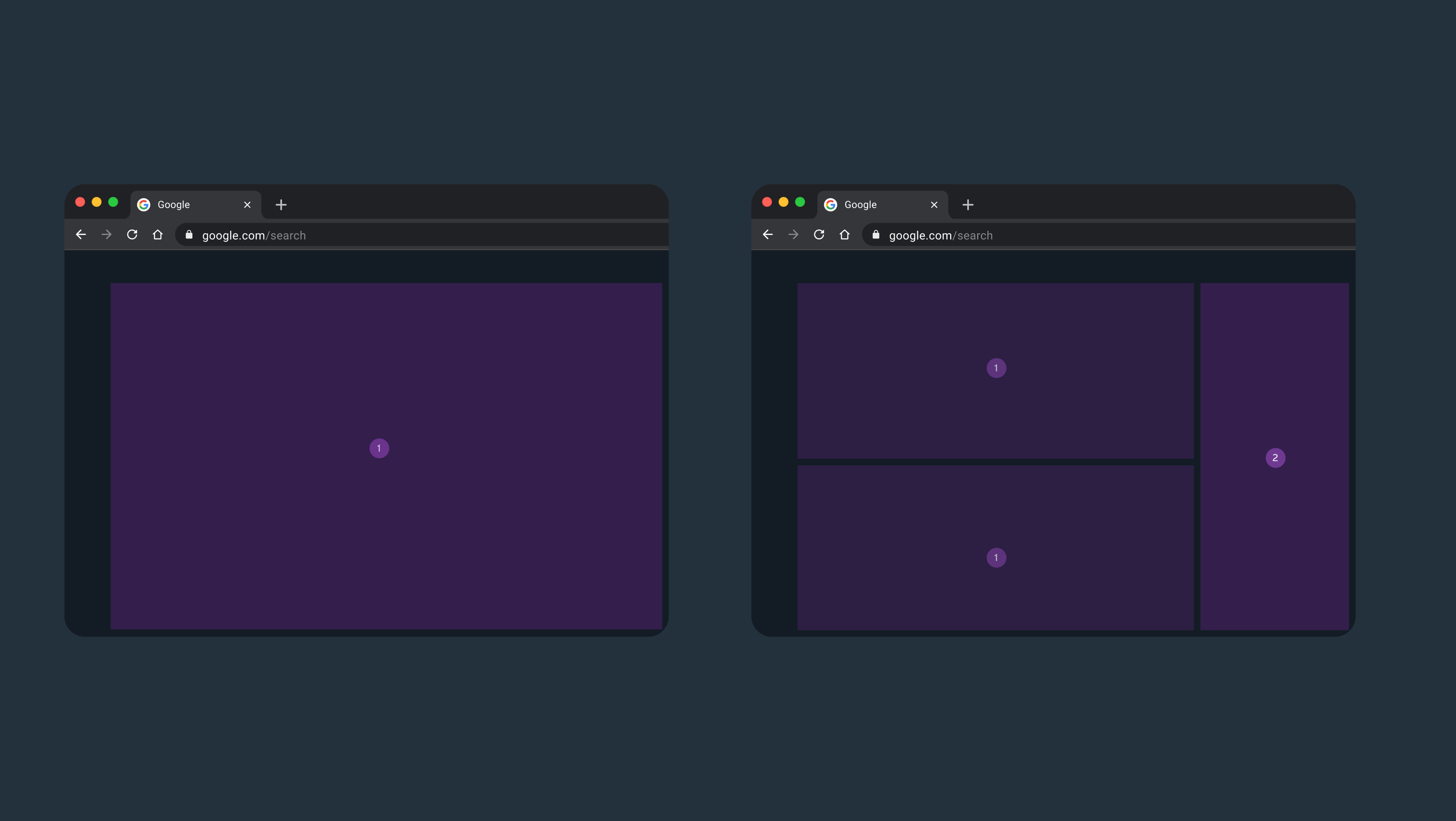
Content in the body region is grouped into one or more panes. The arrangement and relative size of the layout regions and panes will vary depending on the device’s screen size. A pane is different from a screen, which refers to the frame containing an app.
Content in a pane can be displayed in multiple columns to segment and align content. Columns are exclusive to a pane and are not used at the screen level.
There are two main pane types:
- Fixed: fixed width.
- Flexible: responsive to available space, can grow and shrink.
The recommendation will be:
- Single-pane layout: use one flexible pane
- Two-pane layouts: typically use one fixed and one flexible pane, which can appear in whatever order is best for the content.
The arrangement and relative size of the layout regions and panes will vary depending on the screen size. Atmosphere reccomends this distribution:
- Extra Small: 1 pane
- Small: 1 or 2 panes
- Medium: 1 or 2 panes
- Large: 1 to 2 panes with standard side sheet serving as a potential additional 3rd pane.
- Extra-large: 1 to 2 panes with standard side sheet serving as a potential additional 3rd pane.
Default layout types
Use the default layouts as starting points for organizing common elements in an app.
Each layout considers common use cases and components to address expectations and user needs for how apps adapt across window class sizes and breakpoints.